Showing posts with label ancillary. Show all posts

Monday, 30 April 2012

final ancillary advert


the reason why we had developed this advert was because we thought it went well with the name of the album which is unrest and especially our music video. we thought that it would almost give you an insight in the  mind of the singer himself and show distorted his mind is. we used these colours to show exactly how mad his mind is. we used big letters and white to make sure its perfectly visible. we also decided to put our digipak cover on it to show what the album will look like. we tried to make it seem authentic by saying its on iTunes. we decided to choose this theme as it links up well with the theme of our video.


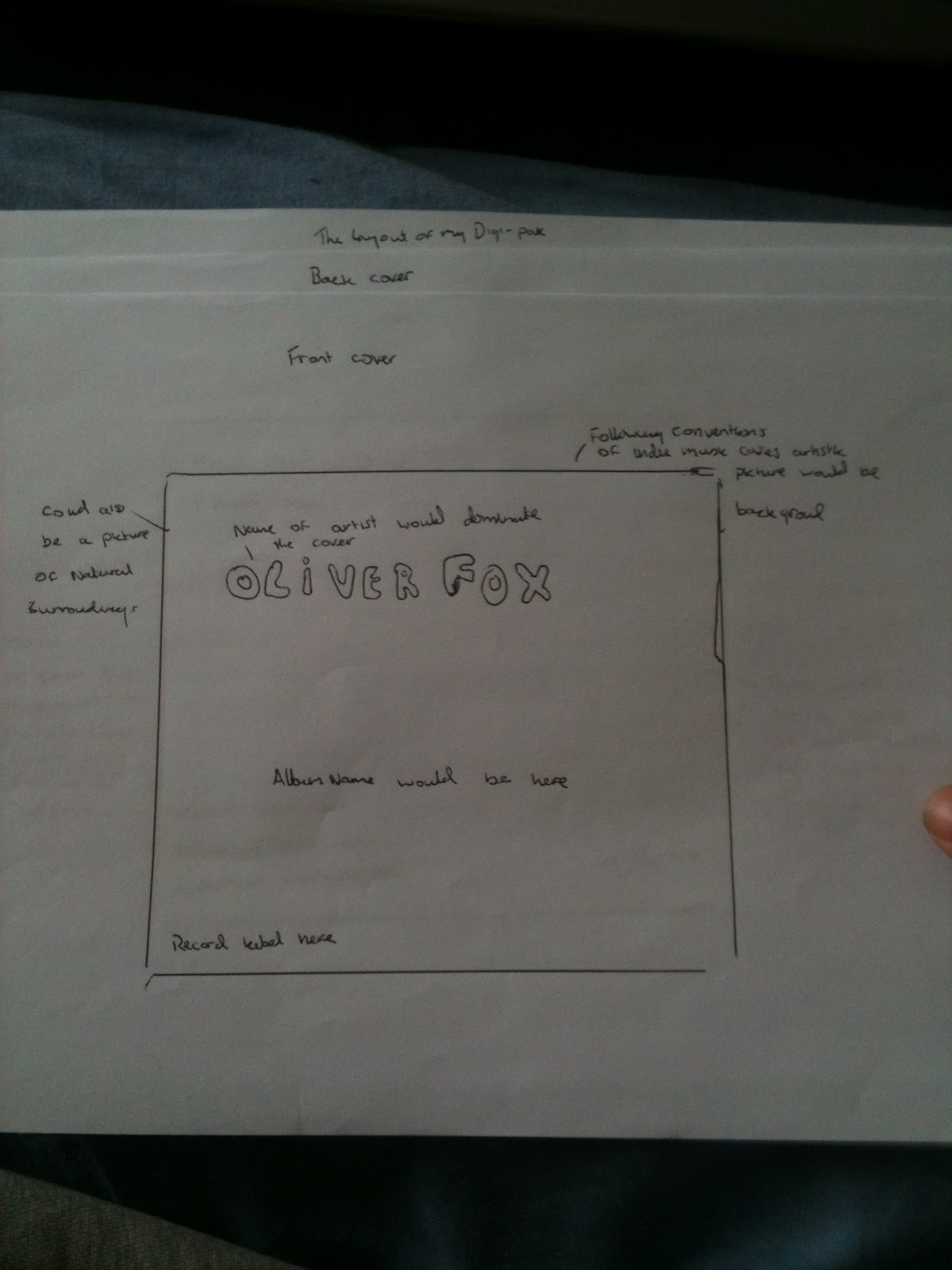
we designed this one to be a direct link between our music video and the advert. we fulfilled the conventions in this by using natural light natural surroundings as well. we decided our actor should be prominent in this picture. we made sure he had the same clothes on as he does in the video again this is done to strengthen the link between this product and the music video. we tried to make the lettering stand out by making it bold and gave all the right information needed. this was done to make it authentic as well as having the HMV logo on it and the riddle records sign in the centre of the bottom on this advert.

Sunday, 15 April 2012

advert conventions

This magazine advertisement of Kings of Leon just has a blurry picture of what is a beach since there are palm trees and sunlight. The title of the band is at the top in a big font. The title of the album is in the same font and colour except a bit smalller so that the artist's name stands out more. The release date of the poster is in a similar font. The title ' Come Around Sundown' fits in with the beach/sun theme of the poster. I think it's a really simple but effective poster. The poster also looks vintage, like it was made in the 60s which also goes with the indie image that Kings of Leon have.

the snow patrol name is in bold red to make it stand out against the white background it has all the information for one of their gigs and also has information on the album release.  The large picture draws attention to the advertisment and all the sponsers that are with snow patrol.

digipak conventions


from these digipak front covers in the indie conventions i can see that art is a big part of the apperence of the digipak this will therefore make it easier to decide how to go forward with the front cover of the digipak we will create. abstract art is very normal in the indie music digipaks. Even down to the colours both are different even though they are in the same genre. snow patrol digipak cover has dark colours but it also has a focus on the bright colour white which is a convention of the indie genre. the Kings of Leon digipak has a very bright and colourful cover with the abstract art in the centre almost depicting a fight between light and dark. this could be done to show the kind of songs that will be on the album. it also could be the relation to the name of the album 'only by the night' which would justify the use of dark colours in a indie cover.

My individual plan for digipak

Here are my initial plans before we decided as a group how our digipak would be laid out
here is the front cover that i had designed (would have drawn a pictiure but im a terrible drawer)

here is the back cover i had made

this would have been the lay out i would have done as it is nice and simple (in truth the group agreed one is much better)

and here is the mind map i used to decide what needed to be in the the digipak

final digipak version analysis

the front cover of this digipak is very artisitc and has the same themed colouring of the digipak it draws the attention of the audience. The images in the digipak consist of natural surroundings nature being a big theme in this digipak and is one of the conventions of indie music videos therefore it follows the convetions very well. throughout our digipak we have gone for images of nature like on our top two (centre and right side) both incorporate nature as its what fits into the indie music conventions. we picked the colours we did because we found other indie digipaks often use bright colours. it also serves the purpose of showing our singer not in the right state of mind this is done to fit in with the name of the album which is unrest. we felt this would be best shown with different colours. we also thought it was important to show our singer which also follows the conventions. he is wearing pretty much the same clothing as he does in the video this is to create the link between the digipak and our music video.