Monday 30 April 2012

final ancillary advert


the reason why we had developed this advert was because we thought it went well with the name of the album which is unrest and especially our music video. we thought that it would almost give you an insight in the  mind of the singer himself and show distorted his mind is. we used these colours to show exactly how mad his mind is. we used big letters and white to make sure its perfectly visible. we also decided to put our digipak cover on it to show what the album will look like. we tried to make it seem authentic by saying its on iTunes. we decided to choose this theme as it links up well with the theme of our video.


we designed this one to be a direct link between our music video and the advert. we fulfilled the conventions in this by using natural light natural surroundings as well. we decided our actor should be prominent in this picture. we made sure he had the same clothes on as he does in the video again this is done to strengthen the link between this product and the music video. we tried to make the lettering stand out by making it bold and gave all the right information needed. this was done to make it authentic as well as having the HMV logo on it and the riddle records sign in the centre of the bottom on this advert.

our finished video

our video so far!!


Storyboard analysis


In this picture i have the first scenes of our video we have the opening credits we show the name of the with the song name. it will be on the chalk board at school to show the opening title. The other pictures depict the main character stalking the girl he loves outside Starbucks this is the main section of our story and we show him shooting her also at the end with the story ending with darkness. we have mostly gone for medium shots this is because they fill the conventions of indie music videos and because it is the most effective way to see the story from the point of view of the main character. we felt that this would be good for the story as it shows obsessive love and the song is about love so the two do fit in together. this is the point you realise that the main character is deranged and dangerous. we added a school scene this is too show how he met the girl and to give the audience an idea of the age the character is.
in this section of the story board we see the main character taking the girl hostage. the camera shots are now closer and we have also included some performance clips so its not completely narrative this is to make people understand that the main character is in fact our singer Oliver Fox. it also shows his regret at killing the girl he loves and even shows him in the car reconsidering the kidnap. this is to show the human side is still there and he is conflicted by his obsession and love for this girl. on the scenes he shows regret we have done close ups this is to show how conflicted he is about the situation and the audience can he how much trouble he is having deciding if he should do this or not.
in this page we see his obsession in full as he has pictures of the girl all over his room and it shows his hearts desire which is holding hands with the girl and having a picnic which he replicates later on but instead forces her rather than her being there willingly like his fantasy. it again has another performance clip to show the band as a whole. this also shows where he first meets the girl and where his obsession begins.


Monday 23 April 2012

Audience evaluation of our music video


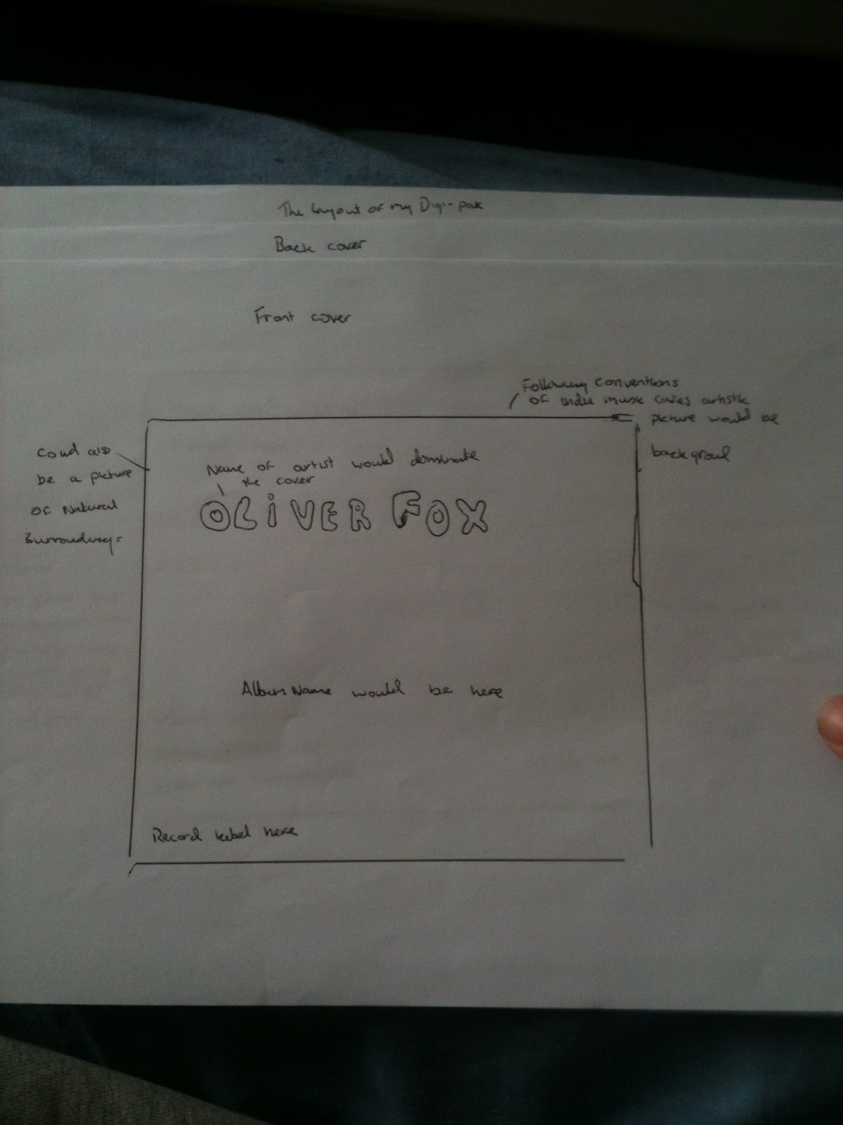
On the 19th of March we held a viewing evening for all our music videos. This was done to gain the feedback from the audience. We looked at our results and found that many people loved our music video. I will go through this question by question and then sum up the results. It was also shown to a year 7 class to get more results.

Question 1: Did you think the choice of settings in the video were appropriate?
From the results I have seen many people thought that the settings were perfect for our video. On quote summed up the general feeling ‘was very good setting suited the song’ this is what many of the audience thought. One of the negative comments where all similar for this question ‘thought it shouldn’t be in a public park’ this is the feeling of the other negative comments we received.

Question 2: How successful was the video in satisfying the conventions of the genre?
For this question the audience again thought our video satisfied the conventions of the indie genre with 35 people agreeing that our video is very good. We also had 2 negative responses from our audience. But as the majority liked our video we can safely assume that we did satisfy conventions of the genre. Some of the comments we got where ‘it was very clear that the genre of the music video was indie’ and ‘satisfied conventions effectively’


Question 3: How successful is the editing?
From the people we asked 33 of them had positive comments ranging from ‘all good’ to ‘the transitions where sharp and clear. This is very good for our video as it was overwhelmingly liked by the audience. We had 3 negative comments about the transitions and editing one of them said ‘could use more effects over the song’ taking this into consideration if we was to do this again we could look into making more editing but we and many of the audience thought we had a sufficient amount.


Question 4: How successful were the choice of camera angles and movement?
36 people had positive reviews of the camera angles and movements we used. We tried to use a range of different camera angles and techniques but also tried fitting it into the conventional camera shots that indie music use. We had received 4 negative responses from the audience on camera shots with one quote being ‘didn’t notice any extra good thing average’ this is something we didn’t want people to think but as it is a small number of people who felt this way we can safely assume that it was fine and some peoples tastes in camera movement could cloud judgement of our work.


Question 5: Did the narrative of the music video suit the song overall?
35 people had positive responses to our music video which means that it was highly successful in falling into the conventions of the indie genre. We had 4 negative responses with one saying that the song and the video didn’t complement each other which is disappointing that they would think this but we had good comments such as ‘the song is about love and so is the music video’. We are happy that people could see the theme that we were going for even if some others didn’t.


Question 6: Was the In the video easy to follow?
we had 33 positive responses to this question with people saying ‘it made complete sense’ and ‘yes- it was very clear that who the main character was’. We also had 5 negative responses with one saying ‘not really’ if we were to do this again we could try and make it even clearer than we made it already what the video was about.


Question 7: Were you entertained throughout the video?
35 people had positive reviews of our video and said they were entertained throughout the video but we had 3 negative responses to it with one saying ‘no it got boring’ this is not great but it’s something we will take on board. But the good responses had this to say ‘yes the story was interesting’ this shows that our video was entertaining.


Question 8: Which section of the video was most successful and why?
Many people said they loved the beginning because they got to meet the characters and it built suspense from the beginning and got them wondering what would happen next. This was one of the questions that most people didn’t fill in I believe it was because they didn’t understand what was being asked.

Question 9: what could we do to improve this?
We were given a few suggestions on how we could improve our video which I will list now:
·         Have our main actor keep his hair the same throughout the video
·         Paint the plastic gun black (as it is currently blue)
·         Better setting for the killing scene
These were the changes that they would have wanted for this music video to be almost perfect therefore we can be happy that it was pretty minor changes and nothing too drastic.

Ratings out of 10
We found that the scores we had averaged about 8-9 out of ten with even a few10 out of 10s this shows how successful our video was and shows that people really did enjoy our work. The lowest score I had got was a 5 but it was for only one person so its not as pressing as it would seem.

Ages
The ages of people who filled our audience is as follows:
·         0-20 = 28
·         21-34= 10
·         35-51= 10
·         52+= 6
This shows we had a large age range even though most of the people asked were between 0-20.

Gender- not complete results
Male:10
Female:14
Not filled in: 5
Although a large portion of this stats wasn’t found we can tell there was roughly equal numbers of genders this yields more accurate results.

Favourite genre
Here are the genres and the numbers we have found:
·         Rock: 15
·         R’n’B: 6
·         Indie: 4
·         Pop: 6
·         Country: 1
·         Mixed: 2
This shows that all different people had watched our video and liked it even though its not their favourite genre.

Sunday 15 April 2012

production diary


January
Our filming started this month this was very exciting but needed to know where to start and what locations exactly we should use. Two members of our group filmed the introduction to our music video. This was meant to be at the very beginning of the video but after consideration it was moved further into the video. It was the scene that shows the main character showing his first signs of love for our other actor and group member Hannah.  When we got the footage back to class we had to try and piece them together it was here I think we all realised it wasn’t going to be as easy as we first may have thought (well this is true in my case anyway) once we pieced together where we wanted everything we had to try and find a transitional effect that would make the change between scenes work seamlessly which thanks to Hannah and Radhika’s expertise with final cut pro we did so.
February
 We had started working on the ending scenes and getting random shots of blue skies, driving by the town, birds flying by. We encountered other problems such as our schedules preventing us from meeting all together a lot of the time. But still filming was getting done and we was all editing the video together and giving our opinions of what should be where and how we should add effects when we change scenes. We also decided which of those little scenes would be in the final video (the birds, blue skies) me and Marissa had filmed the town passing by while I drove but we decided not to use this
March
This was the busiest month we had most of the filming was done now. Most of the video was shot this month with the performance scenes filmed and then the final scene. We still had the kidnaping scene left to do. But problems had been encountered in this month firstly when shooting the final scene we had dog walkers going by randomly which kind of killed the effect of drama we was going for but we had another scene filmed the same day which didn’t have the same problems. This was then edited and pieced together. We realised that we still had about 30 seconds left to fill in in the middle. Radhika had a great idea of taking many still images of chess pieces going all over the board to represent the main character chasing the girl which was put together really well.
 April
During our two week holiday we met up to film the section to our video. But we had a big problem our actor had cut his hair!! This was especially bad as these scenes are in the middle of the video so it would go from long hair to short hair then back to long hair. There was nothing to be done so we just shot our last scenes in which I had been filming the rest of the group as they were all the actors as well.  I had to get to grips with different techniques like over the shoulder shots medium shots and tracking shots. We encountered another problem on that outing which was the camera we was using ran out of battery. But luckily Hannah had brought her camera along too so we could continue filming as normal. Once we had the kidnapping scene done we decided to get our actor to lip sync the whole song so we could use some of it as another performance clip. Thus we had thought we finished but just needed to edit the film together which was done on final cut pro. We had a showcase coming up and needed to get the video completely finished. So we added our introduction to the song filled in a 2 second gap with a clip of a burning candle that Hannah had taken earlier that day and then put finishing credit. Thus we have finished our video and we now hope everyone enjoys it.

advert conventions

This magazine advertisement of Kings of Leon just has a blurry picture of what is a beach since there are palm trees and sunlight. The title of the band is at the top in a big font. The title of the album is in the same font and colour except a bit smalller so that the artist's name stands out more. The release date of the poster is in a similar font. The title ' Come Around Sundown' fits in with the beach/sun theme of the poster. I think it's a really simple but effective poster. The poster also looks vintage, like it was made in the 60s which also goes with the indie image that Kings of Leon have.

the snow patrol name is in bold red to make it stand out against the white background it has all the information for one of their gigs and also has information on the album release.  The large picture draws attention to the advertisment and all the sponsers that are with snow patrol.

digipak conventions


from these digipak front covers in the indie conventions i can see that art is a big part of the apperence of the digipak this will therefore make it easier to decide how to go forward with the front cover of the digipak we will create. abstract art is very normal in the indie music digipaks. Even down to the colours both are different even though they are in the same genre. snow patrol digipak cover has dark colours but it also has a focus on the bright colour white which is a convention of the indie genre. the Kings of Leon digipak has a very bright and colourful cover with the abstract art in the centre almost depicting a fight between light and dark. this could be done to show the kind of songs that will be on the album. it also could be the relation to the name of the album 'only by the night' which would justify the use of dark colours in a indie cover.

My individual plan for digipak

Here are my initial plans before we decided as a group how our digipak would be laid out
here is the front cover that i had designed (would have drawn a pictiure but im a terrible drawer)

here is the back cover i had made

this would have been the lay out i would have done as it is nice and simple (in truth the group agreed one is much better)

and here is the mind map i used to decide what needed to be in the the digipak

final digipak version analysis

the front cover of this digipak is very artisitc and has the same themed colouring of the digipak it draws the attention of the audience. The images in the digipak consist of natural surroundings nature being a big theme in this digipak and is one of the conventions of indie music videos therefore it follows the convetions very well. throughout our digipak we have gone for images of nature like on our top two (centre and right side) both incorporate nature as its what fits into the indie music conventions. we picked the colours we did because we found other indie digipaks often use bright colours. it also serves the purpose of showing our singer not in the right state of mind this is done to fit in with the name of the album which is unrest. we felt this would be best shown with different colours. we also thought it was important to show our singer which also follows the conventions. he is wearing pretty much the same clothing as he does in the video this is to create the link between the digipak and our music video.


initial branding

Before deciding names of the song the artist and the albums we decided to ask friends and other people what they thought of the names. The artist is called Oliver Fox, the album will be called Unrest and the song we made will be called Nights of broken sleep. In this post i will give a general view of the audience to each of the names.

What do you think of the name Oliver Fox?
The people i asked loved the name and said it gave an exciting image to the artist. They also said that it was easy to remember as it is so different from other artists which made it different and more likely to stand out to the audiences. i had asked 10 people this questions and 9 out of 10 said they liked it and that it fit in nicely with the conventions of indie music.

What do you think of the album name 'Unrest'?
Again i asked the same people what they thought of this name and 10 out of 10 said they liked the name. They said that it was very appropriate given the name of our song and that if fits in with the short snappy album names that are being released today.

What do you think of the song name 'Nights of broken sleep'?
When i asked if they liked the name of the song 8 out of 10 people said they liked the name of this song name as the main theme is obsessive love they thought that the name was very approriate. The two people who didnt like it stated that they felt it was too over the top in sadness and could of toned it down a bit.

location pictures

one of the places we filmed at was at a local shopping centre not far from school

we also used local parks as a location for our filming where most of it would take place

we also used a local pub and florist.

we also had a scene in our school