This magazine advertisement of Kings of Leon just has a blurry picture of what is a beach since there are palm trees and sunlight. The title of the band is at the top in a big font. The title of the album is in the same font and colour except a bit smalller so that the artist's name stands out more. The release date of the poster is in a similar font. The title ' Come Around Sundown' fits in with the beach/sun theme of the poster. I think it's a really simple but effective poster. The poster also looks vintage, like it was made in the 60s which also goes with the indie image that Kings of Leon have.
the snow patrol name is in bold red to make it stand out against the white background it has all the information for one of their gigs and also has information on the album release. The large picture draws attention to the advertisment and all the sponsers that are with snow patrol.
Sunday, 15 April 2012
digipak conventions
from these digipak front covers in the indie conventions i can see that art is a big part of the apperence of the digipak this will therefore make it easier to decide how to go forward with the front cover of the digipak we will create. abstract art is very normal in the indie music digipaks. Even down to the colours both are different even though they are in the same genre. snow patrol digipak cover has dark colours but it also has a focus on the bright colour white which is a convention of the indie genre. the Kings of Leon digipak has a very bright and colourful cover with the abstract art in the centre almost depicting a fight between light and dark. this could be done to show the kind of songs that will be on the album. it also could be the relation to the name of the album 'only by the night' which would justify the use of dark colours in a indie cover.
My individual plan for digipak
Here are my initial plans before we decided as a group how our digipak would be laid out
here is the front cover that i had designed (would have drawn a pictiure but im a terrible drawer)
here is the back cover i had made
this would have been the lay out i would have done as it is nice and simple (in truth the group agreed one is much better)
and here is the mind map i used to decide what needed to be in the the digipak
final digipak version analysis
the front cover of this digipak is very artisitc and has the same themed colouring of the digipak it draws the attention of the audience. The images in the digipak consist of natural surroundings nature being a big theme in this digipak and is one of the conventions of indie music videos therefore it follows the convetions very well. throughout our digipak we have gone for images of nature like on our top two (centre and right side) both incorporate nature as its what fits into the indie music conventions. we picked the colours we did because we found other indie digipaks often use bright colours. it also serves the purpose of showing our singer not in the right state of mind this is done to fit in with the name of the album which is unrest. we felt this would be best shown with different colours. we also thought it was important to show our singer which also follows the conventions. he is wearing pretty much the same clothing as he does in the video this is to create the link between the digipak and our music video.

initial branding
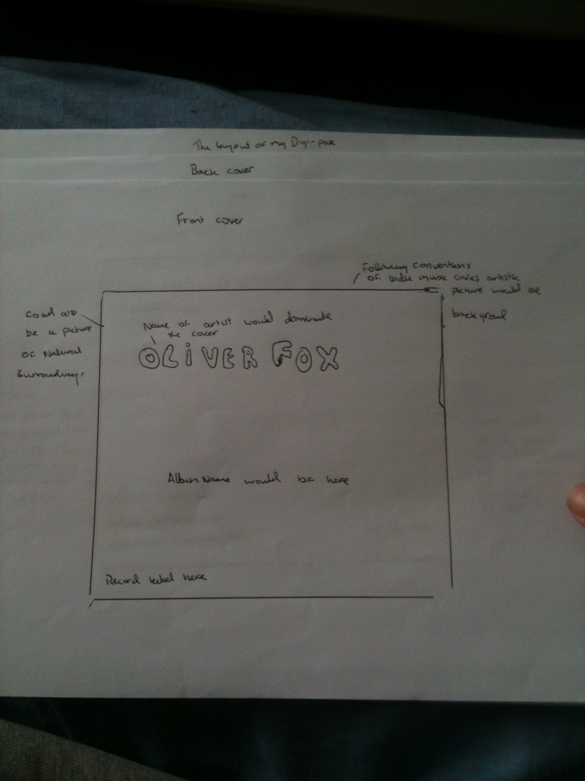
Before deciding names of the song the artist and the albums we decided to ask friends and other people what they thought of the names. The artist is called Oliver Fox, the album will be called Unrest and the song we made will be called Nights of broken sleep. In this post i will give a general view of the audience to each of the names.
What do you think of the name Oliver Fox?
The people i asked loved the name and said it gave an exciting image to the artist. They also said that it was easy to remember as it is so different from other artists which made it different and more likely to stand out to the audiences. i had asked 10 people this questions and 9 out of 10 said they liked it and that it fit in nicely with the conventions of indie music.
What do you think of the album name 'Unrest'?
Again i asked the same people what they thought of this name and 10 out of 10 said they liked the name. They said that it was very appropriate given the name of our song and that if fits in with the short snappy album names that are being released today.
What do you think of the song name 'Nights of broken sleep'?
When i asked if they liked the name of the song 8 out of 10 people said they liked the name of this song name as the main theme is obsessive love they thought that the name was very approriate. The two people who didnt like it stated that they felt it was too over the top in sadness and could of toned it down a bit.
location pictures
one of the places we filmed at was at a local shopping centre not far from school

we also used local parks as a location for our filming where most of it would take place

we also used local parks as a location for our filming where most of it would take place
we also used a local pub and florist.
we also had a scene in our school
Monday, 12 March 2012
CD panel design
this is the final draft of my CD panel
I had combined two of my best pictures to get this one and copy and pasted the picture changing the colours each time then i brought it together to create this. here are the pictures i started with
the reason i decided on these pictures was because it fit in with the conventions of the indie genre. i also thought that it would be good to put on the CD panel because both the pictures look lonely and distant which is what the theme of the album name is. i thought it it goes well with the album name unrest because it represents the artists loneliness and show him to be separate from the rest of the word which i thought these pictures typify brilliantly
Subscribe to:
Posts (Atom)